comments |
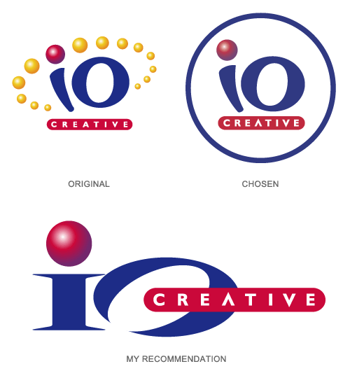
People were mistakingly reading the original logo as "Ten Creative." The goal was to avoid this confusion while making the logo look a bit more professional. It was also important to keep the essence of original logo. My recommendation for the revised logo was ultimately rejected in favor of something closer to the original. I personally don't think the chosen version is nearly as strong, but it does work.
Five years later, inspired by treatment given to the logo on the ioCreative website, I brought the logo through another update. We refer to this latest version as the "glossy muted" variation. |